Inside the MainLayout component, it references a NavMenu component. This represents all the links in the navigation menu that appears on the left-hand side of the page.
<!-- MainLayout.razor -->
<div class="page">
	<div class="sidebar">
		<NavMenu />
	</div>

	...
</div>
The NavMenu component renders the links using the NavLink component. This link component is built-in to the Blazor framework, and it allows a link to be highlighted as active if it's routed to the same page that is being linked.
NavLink component has a number of attributes that can be set. This is similar to the HTML a tag, and allows for the link to be set with the href attribute, as well as any class names.
<!-- NavMenu.razor -->
<div class="top-row ps-3 navbar navbar-dark">
	<div class="container-fluid">
		<a class="navbar-brand" href="">RoundTheCode.BlazorComponent</a>
		<button title="Navigation menu" class="navbar-toggler" @onclick="ToggleNavMenu">
			<span class="navbar-toggler-icon"></span>
		</button>
	</div>
</div>

<div class="@NavMenuCssClass nav-scrollable" @onclick="ToggleNavMenu">
	<nav class="flex-column">
		<div class="nav-item px-3">
			<NavLink class="nav-link" href="" Match="NavLinkMatch.All">
				<span class="oi oi-home" aria-hidden="true"></span> Home
			</NavLink>
		</div>
		<div class="nav-item px-3">
			<NavLink class="nav-link" href="counter">
				<span class="oi oi-plus" aria-hidden="true"></span> Counter
			</NavLink>
		</div>
		<div class="nav-item px-3">
			<NavLink class="nav-link" href="fetchdata">
				<span class="oi oi-list-rich" aria-hidden="true"></span> Fetch data
			</NavLink>
		</div>
	</nav>
</div>

@code {
	private bool collapseNavMenu = true;

	private string? NavMenuCssClass => collapseNavMenu ? "collapse" : null;

	private void ToggleNavMenu()
	{
		collapseNavMenu = !collapseNavMenu;
	}
}
The MainLayout component also renders the Razor syntax @Body. This will route to a Razor component depending on the route data that is set.
<!-- MainLayout.razor -->
<div class="page">
...
<main>
<div class="top-row px-4">
<a href="https://docs.microsoft.com/aspnet/" target="_blank">About</a>
</div>
<article class="content px-4">
@Body
</article>
</main>
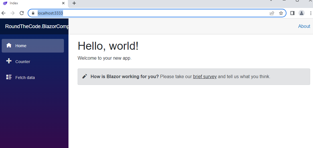
</div>For example, the home page will route to the Index component. It knows that because the Index component contains the @page directive which has it's parameter set to /.
<!-- Index.razor -->
@page "/"

<PageTitle>Index</PageTitle>

<h1>Hello, world!</h1>

Welcome to your new app.

<SurveyPrompt Title="How is Blazor working for you?" />
When loading the Blazor WebAssembly application, it renders the navigation links on the left-hand side and the content on the right-hand side.